Page Width Suggestion

Joined
Aug 13, 2006
Messages
203
Reaction score
3
.
Hello. I apologize if this is the wrong section or just not really worth submitting.
I'm just requesting two smallest changes to the website. First and mainly, it is that the
Design page on these message boards kind of seems too wide, and I think it would
look a little better shortened, similar to something you'd find on other sites.
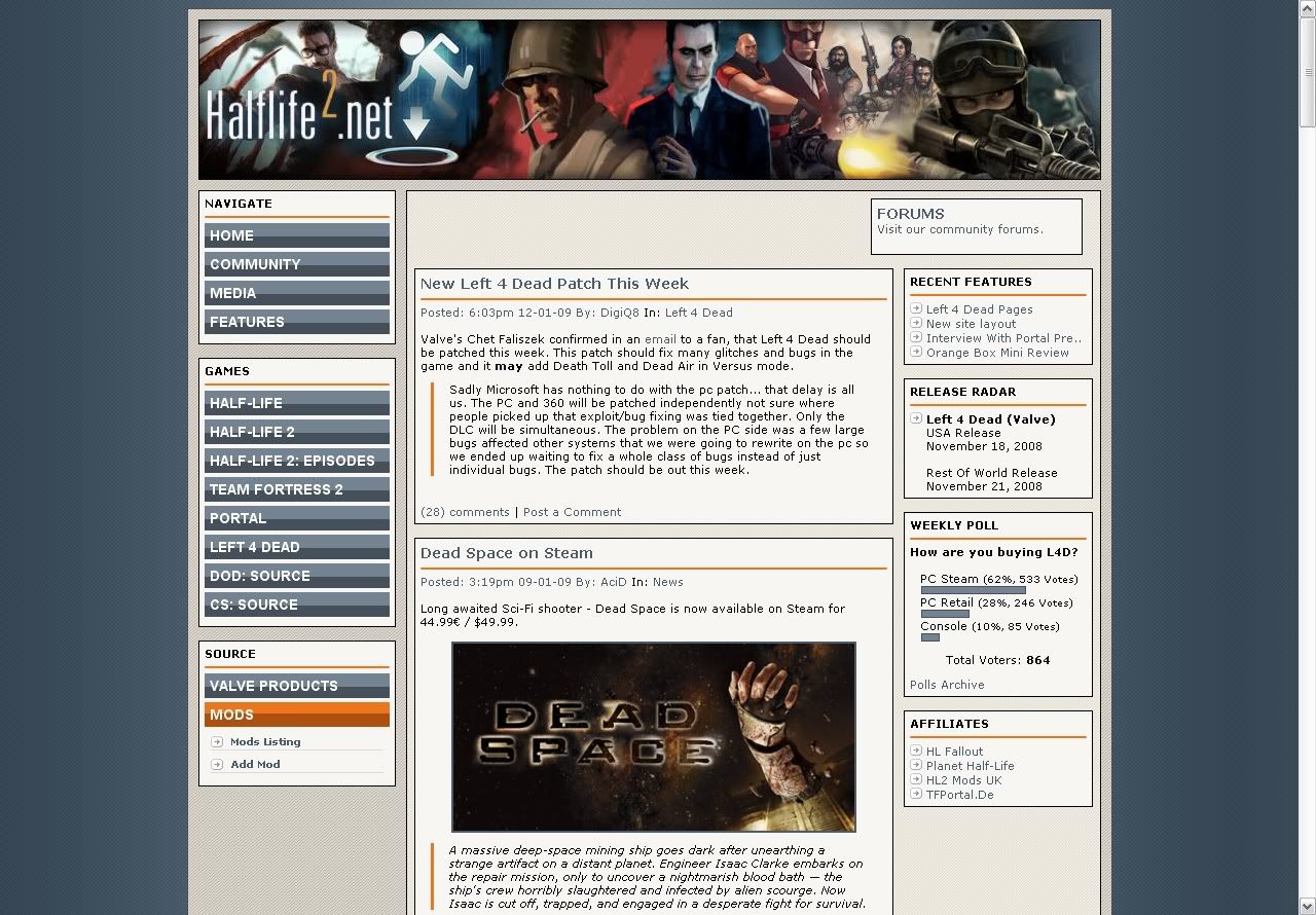
Take your welcome screen, for example:


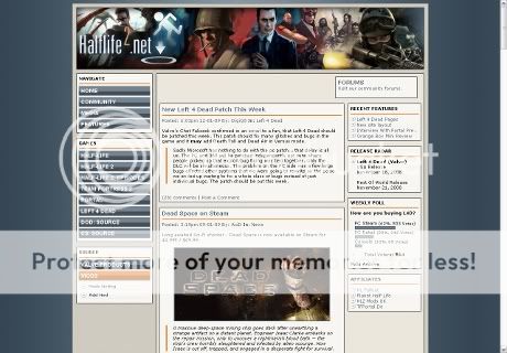
It looks great, and a lot of things have been looking grand since the old update.
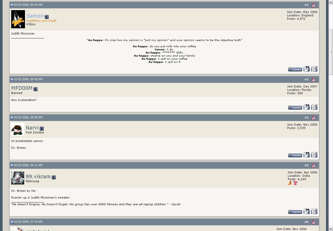
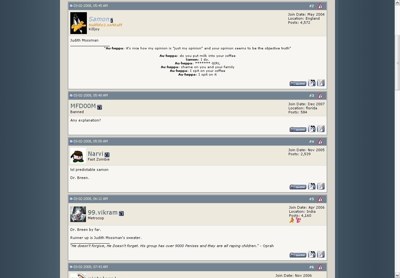
Now here is a random Forum snapshot:


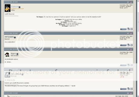
I guess this idea should be addressed to someone like Hectic Glenn, but I'm basically
suggesting you could do something like this:


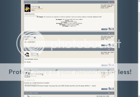
It's just a tiny suggestion and it's mainly mentioned because it's sometimes difficult to
draw eyes all across the screen when reading long posts, unless you window it, of course.
It's obviously up to you if it looks better or not, I just grabbed the side background from
your home page just to throw in what I'm trying to say. I just thought I'd mention it is all.
I'm sorry for being a pain. :p


There's one second smallest thing, and it's the tiniest detail: the site Banner image.
This is the one I'm talking about:
head_logo.jpg


I've always loved it and great work to whoever put it together. Every time I see that,
I just notice the Left 4 Dead characters are the abandoned design valve re-did and the
little zombie is the only screenshot in the image, which I guess can kind of make it
perfect, but I was wondering if it might go better with the updated artwork images.

Here is a quick tiny retouch I did for an example. Everything is taken from VALVe artwork:


head_logo-02.jpg


Anyway, sorry for mentioning these unnoticeable things, I'm not trying to tick anybody off. :p
 
The old ones are cooler.
The retouch would be good, but Louis stands out way too much.
 
Yeah, I agree. I did an awful job on it, but it's good enough to express what I was roughly aiming at. :p
Oh, and what old ones?


.
 
The forums should have a different banner. A simpler one. And I like the forum width.
 
The forum width isn't likely to be changed. We've had things like this since year dot, and it's rarely a problem unless someone posts something massive and stretches the page (which moderators will edit to fit).

The main banner does include old L4D models you are correct. We will get that fixed this coming week hopefully.

The forum doesn't have a banner as it requires different dimensions to the one from the main site, and from tests I don't believe it really works on the forum nicely. Any banner we put up for the forum would need to be fairly minimalist and the dimensions are the current 'placeholder' we have. We have older ones, but we'd rather not go back to them :p
 
They could just add a simple javascript CSS switcher, like this.

They'd have to add some cookies code to it to remember your choice though.

Then just stick a div around the whole site and make the buttons/links change the CSS width attribute to 80% or whatever.
 
The forum width isn't likely to be changed. We've had things like this since year dot, and it's rarely a problem unless someone posts something massive and stretches the page (which moderators will edit to fit).

The main banner does include old L4D models you are correct. We will get that fixed this coming week hopefully.

The forum doesn't have a banner as it requires different dimensions to the one from the main site, and from tests I don't believe it really works on the forum nicely. Any banner we put up for the forum would need to be fairly minimalist and the dimensions are the current 'placeholder' we have. We have older ones, but we'd rather not go back to them :p

Okay, thank you for your reply. I will obviously ignore the width suggestion now that it is clear everybody
would rather it the way it is.


Get a smaller screen.

I actually have quite a small screen at the moment.
 
I wouldn't actually mind a fixed-width option for the forum layout, since I have a 26" monitor... most posts are one line long
 
At first I was like
Code:
>:O

But then, I thought, hey, actually, that's not such a bad idea.

Although my monitor is enormous.
 
There's no way it's bigger than 26" widescreen. If so, I guess I need to buy another monitor.
 
Actually, now that I'm on my bigger monitor it works perfectly fine for me. I don't get those bars.
 
Otto, you're talkin about a really small difference, which in my opinion will make it look run of the mill for no specific purpose.
 
There's no way it's bigger than 26" widescreen. If so, I guess I need to buy another monitor.
Nah, it's just a lot bigger and wider than I'm used to. Which is what she said.
 
Oh, I suppose this has little to do with the over-lay, but I didn'y want to make a whole thread just for this.
This Ad was on the top of the main page below the banner.
imgad


seriously? What?

Why is that even there? of all ads, that one
 
Could you get the link location / source for that advert and PM it to me if you see it again. I'll speak to Munro about getting it blocked...Gah!
 
Otto, you're talkin about a really small difference, which in my opinion will make it look run of the mill for no specific purpose.


'look run for the mill'? Yeah, I know it's really tiny and I'm sorry for wasting anybody's time.
I just thought it might look better and if you along with everyone else doesn't think so, then it's certainly an awful idea.
I'm fine with this topic being locked or abandoned now. There's no need for it on my part as I've received my answers,
thank you. :)
 
Dodo, the creator of our original banner has updated his work to include the new L4D models now + another friend hiding somewhere. I think he's done a great job updating it, what do you guys think?

head_logo.jpg
 
I wish that banner showed up on the forums, but hey, it looks fine as it is.
 
The banner has been updated and I have also added a new forum skin with a fixed width.
 
I miss the random, scary as **** zombie that used to be hiding in there.
 
Dodo, the creator of our original banner has updated his work to include the new L4D models now + another friend hiding somewhere. I think he's done a great job updating it, what do you guys think?

head_logo.jpg


Ah, I didn't even notice. Awesome work, that looks great. :D

.
 
This fixed width sucks for people with wider monitors...

EDIT: Just found the switcher... *phew*
 
This fixed width sucks for people with wider monitors...

EDIT: Just found the switcher... *phew*

heh I dunno I have a 26" widescreen lcd and having an option for fixed with is a godsend, since I dislike it when the posts are 1920px wide (makes for a lot of one-liners).
 
heh I dunno I have a 26" widescreen lcd and having an option for fixed with is a godsend, since I dislike it when the posts are 1920px wide (makes for a lot of one-liners).

Exactly my thoughts.
 
Haha, I didn't even notice it was adjusted. Wow, thanks a bunch, guys. I like it, anyway. :)


Ennui said:
heh I dunno I have a 26" widescreen lcd and having an option for fixed with is a godsend, since I dislike it when the posts are 1920px wide (makes for a lot of one-liners).


Yeah, exactly. Yet ktimekiller still complains.
 
Back
Top