Navigation
Install the app
How to install the app on iOS
Follow along with the video below to see how to install our site as a web app on your home screen.

Note: this_feature_currently_requires_accessing_site_using_safari
More options
You are using an out of date browser. It may not display this or other websites correctly.
You should upgrade or use an alternative browser.
You should upgrade or use an alternative browser.
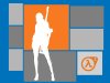
New wallpaper "HL2-Extruded"
- Thread starter BWMASTER
- Start date
Delicious Bass
Newbie
- Joined
- Jun 29, 2003
- Messages
- 781
- Reaction score
- 0
that kicks ass
rec
Newbie
- Joined
- Sep 13, 2003
- Messages
- 960
- Reaction score
- 0
Don't really like the current piece, however there's lots of room for change, it has the potential to become a kick-arse abstract piece.
I think my main concern is consistancy, the Half-Life 2 logo throw it right out. Another thing to consider is colour contrast.
I think my main concern is consistancy, the Half-Life 2 logo throw it right out. Another thing to consider is colour contrast.
A True Canadian
Newbie
- Joined
- Aug 29, 2003
- Messages
- 2,874
- Reaction score
- 2
Originally posted by Snakebyte
Hmmm maybe something more like this:
No offense BWM, but his looks better. The darker colours make the image seem less distorted. Nice work though.
A
arm4000
Guest
for the assassin:
copy to a channel
gaussian blur a decent amount
audjust levels manually
smooth.
copy to a channel
gaussian blur a decent amount
audjust levels manually
smooth.
BWMASTER
Newbie
- Joined
- May 25, 2003
- Messages
- 1,339
- Reaction score
- 0
Thanks for the comments. While I was making the peice I forgot to zoom in and take a closer look. I used the magic marquee tool to select the assasin in 1 sec so I really didn't spent too much time on that.
From a zoomed out perspective it looked fine to me.
From a zoomed out perspective it looked fine to me.
Nostradamus
Newbie
- Joined
- May 17, 2003
- Messages
- 980
- Reaction score
- 0
try spending time on it then?
no hard feelings, but i just think theres being posted too much 2min art on this board
on another note
the assasin eeds to be cleaned up, even though it isnt really looking bad, but not WOW.... and those squares are not really doing any good, no making it stylistiq nd simple, but not making it action packed a bang!
thats about it")
no hard feelings, but i just think theres being posted too much 2min art on this board
on another note
the assasin eeds to be cleaned up, even though it isnt really looking bad, but not WOW.... and those squares are not really doing any good, no making it stylistiq nd simple, but not making it action packed a bang!
thats about it
F
FURYweb
Guest
K so your trying to be minimalist with this piece. Problem is, you have the shape of the figure , but its over complicated to match the rest of the other rectangles (what are they representing?).
It comes across to uneven to me, nothing seems to fit. Give it some meaning or a symbol then yeah, or please explain to me what the rectangles represent.
It comes across to uneven to me, nothing seems to fit. Give it some meaning or a symbol then yeah, or please explain to me what the rectangles represent.
G
Guest
Guest
AHAHAHAHAAHAAAHAHHA