Spawn sketch

Sorze

Newbie
Joined
Nov 1, 2003
Messages
476
Reaction score
0
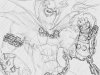
I did this today, took a while..
I'm pretty happy with it so far, and I probably will color it later.

I'd almost forgotten how much fun it is to do characters like these, you can just tell all proportions to go to hell and get crazy!

Tell me what you think, but don't expect any huge changes... I will color it later, but I'll give you a chance to give some c & c suggestions first.


note: It's 1024x768 originally, but the 100kb limit ate up all the detail at that resolution. still does really :P
 

Attachments

  • spawn copy800600.jpg
    spawn copy800600.jpg
    96.2 KB · Views: 248
nice sketch ...even though it is a comic sketch you should try to get the anatomy right. The fist looks a bit off ..other than that the porportions are ok (a little exagerrated but ok nonetheless). Also you should try to vary the "weight" of your lines....right now all lines look to be about the same thickness. Here's an example

http://en.wikipedia.org/upload/0/0d/Bugs_Bunny1.jpg

notice that the lines vary from thin to thick? The lines get thicker on the lower portions of the drawing giving it the illusion of weight
 
Thx alot for the reply, people seem incredibly reluctant to post here in the art forum. Shame. :hmph:


Yeah, I kinda knew about the fist. Hands are the bane of my existence, really, hate doing 'em... I should probably get that sorted before I try to finish it.

And about the lines, I dont really use the sketch as anything more than a map. None of these lines will be visible in the final pic, all the coloring and all that will be on a separate layer.
So the sloppiness doesn't really affect the outcome (well of course it does, wouldn't know what to paint otherwise, just doesn't effect tidyness etc.)

Might be a sucky way of working, but that's how I usually do it,
I need to be sloppy in the beginning!


Thx alot for the crit, I'm not exactly swamped with replies here... :dozey:
 
ya well some people find it hard to criticize other people's work ..I was an art teacher , so it just comes naturally ;)

Most artwork is created in stages , I start with a blueline pencil (blue pencil that doesnt show up when scanned or photographed) and make a rough sketch then go over with whatever media I'm using at the time.

oh and I think every illustrator has a hard time with hands (I do as well sometimes). Look up Leonardo davinci's drawings of hands ...the anatomy is perfect ...it's a good reference
 
I haven't had much time so far, but I've taken a look at the hand, and I'm actually not sure what I should do with it... I think it looks ok...
Suggestions?
 
it does look ok but the angle is a bit off

try standing in front of a mirror in that pose ...you'll notice you dont see all the sides of the fist ...right now I can see the top and the side as well as the back of the hand ...the fingers should only be partially visible
 
Very good, I used to draw spawn and stuff alot a while ago. :)

The angle is abit off and there's some anatomy errors but it looks good imho. Spending time on detailing the chain paid off, it looks great.
 
I haven't changed alot (as I'm not sure what's wrong with it :P ), but tell me what you think..

I'm pretty sure I can get my hand in that angle, atleast it looks like it in the mirror..
 
His hand is pretty good but you must remember that Spawn has uber-super-mega muscles, you shouldn't narrow down his wrist like that, make it wider and more muscular. also, big up his torso a little and add more muscles.

fineart.sk is a good site for reference on anatomy and muscles. :)
 
yeah the second one is much better and more clearly way more understandable.
 
Allright then, I just moved around some stuff changed a few small things, nothing you'll really notice probably... :P

I'll start coloring it now if noone has a suggestion for a huge doodoo somewhere that needs sorting..


Thx for the help guys!
 
Back
Top