web design help

Korgoth

Newbie
Joined
Jul 4, 2003
Messages
3,233
Reaction score
0
Hi guys, I'm using a program called joomla! And I've made a graphic that I would like to use as a locked background/template for my website. I'm pretty novice, so any tutorial links and help would be great. Basically, I have a jpeg image, that I would like to add regular text overlayed, and buttons/urls to navigate.

Please, please help, I'm on a serious time crunch here. Thanks!
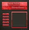
Below is what I'm shooting for, how can I make this work?
And any tips on the design and layout are welcome to :)
 

Attachments

  • Logan_layout_01_lowres.jpg
    Logan_layout_01_lowres.jpg
    73.4 KB · Views: 245
Not exactly the best way of making a site ... specially if its for a paying client.

The best thing to do is to slice that image up and feed it into a table as table backgrounds (rather than have the whole image as a page background).
 
Don't use tables, they're gay.

Also, why are you using Joomla, it sucks, and the site looks pretty simple for a CMS. Joomla templates will be more complex than basic HTML.
 
yeah slicing and css divs are what you need to do. Download the video and you can make a basic site. Use dreamweaver or a source alternitive from sourceforge
 
Hey Korgoth. These other guys already gave some great tips but I had some extra time at work and thought I'd give you a few suggestions myself. First off, one of the main reasons I decided to reply was that this looks very similar to some of the work I did when I was first starting. What graphic editing software are you currently using? I highly recommend getting a copy of photoshop if you are using something else. There are many tasks you can somewhat automate through photoshop once you get the hang of it.

Joomla is nice content management system but it is way too heavy for the level you are currently at. Joomla makes it easy to do everything except for making your site look they way you want without jumping through a bunch of hoops. I currently use a custom built PHP/MySQL CMS that I built from scratch for my clients but there are lots of free/open source CMSs out there that are better for your application than Joomla. I can't remember any off the top of my head but I'll get back to you on this one.

A few things about the screen shot you posted:

------------------------------------------------
Gradients and Textures
------------------------------------------------
Gradients and Textured elements can add a lot to a website, but one thing you should watch out for is the opposite; adding a lot of gradients and textures to a website. If you do use gradients and textures, most of the time (not always) items look cleaner if you use more subtle gradients or textures. Having a faint but noticeable difference tends to look better than a very harsh cut from one color to the next within a button or image.
------------------------------------------------

------------------------------------------------
Color Scheme
------------------------------------------------
Most sites that I work on usually end up having 3 main colors and slight variations of those throughout. Having only 2 colors on a site leaves the site bland and doesn't give you the opportunity to make things 'pop'.
------------------------------------------------

------------------------------------------------
Font Size
------------------------------------------------
Some people will argue with me on this one but I usually choose smaller fonts for most things. Large fonts inside buttons do not leave much room for other details and once again makes it harder to make the text pop. Although the buttons and font of the buttons on your site are large, the buttons overall are still not that easy to read.
------------------------------------------------

------------------------------------------------
Content Containers
------------------------------------------------
If you plan on having a lot of text content or large images, you will need to expand that right side for sure. I am not sure if this was a work in progress or not but I also recommend setting a different color for inside the text box other than the background tone. This once again helps with the pop.
------------------------------------------------

Not trying to insult you in any way shape or form, just wanted to give some helpful suggestions and things that I wish someone had told me when I was first starting out. There are some awesome photoshop tutorials available out there on making various navigation systems. Your best bet is to take a bunch of those and then adapt the different techniques you learned into something you can call your own. Below are a few quick samples of things I whipped up based loosely on what you had just to show you how big of a variety of things you can do with your current setup.

sampletop1.jpg


samplebutton1.jpg

samplebutton2.jpg

samplebutton3.jpg


If you end up wanting to use one of these actual samples I made please talk with me first. Other than that, great job so far and best of luck on your journey to becoming a web developer.

Last notes:

Learn CSS as soon as possible: It saves so much time it is unbelievable. This is especially true when working for a needy client who does not know what they want, but knows for sure that it is not what you have shown them in 10 different formats.

Design with change in mind: Even if a client loves the website when you first start making it, there is no guarantee that as soon as someone else in the company or a loved one of theirs sees it that they will not change their mind. Learn basic PHP as soon as possible!!!. Using a simple include statement to put the same header and footer code on every page will save you countless headaches and time spent making corrections when they have 150 pages and you have to change each one manually because the pages are completely static.

Links(okay so it's only 1 link, but maybe I'll add more as I think of them):
http://www.w3schools.com <- LIFE SAVER: great website with TONS of tutorials for css, html, php etc etc.

And last but not least. Everyone wants to get paid for work they do, so whenever possible try to get at least 25% of the money up front for the job (50% is standard so if you can get that, go for it). This ensures if the client flakes on you at least you got something, and also it keeps them motivated to get you what you need from them since they have already paid you some amount. When I first started I had one client whose website I had put literally 30 hours or so into and then their company started to fall apart (completely unrelated from my work!!). This left me high and dry with a website and no money. Don't let this happen to you! Also if you have any friends in the business or know a lawyer, try to get some simple contracts made up for this purpose.
 
Holy cow, thanks a million Tim8604, that was the shiznite! You need not have gone to all that trouble, but you are absolutely right, those design changes look so much cleaner, so much more "functional", its a good thing I didn't get to deep in this because I've lost contact with the guy I was doing this for before I could even show him anything. Oh well, dodgy business sometimes, eh?

Thanks for the links, and the tips, those are great. Thanks again!
 
Not exactly the best way of making a site ... specially if its for a paying client.

The best thing to do is to slice that image up and feed it into a table as table backgrounds (rather than have the whole image as a page background).

NO

NO NO NO

BAD! BAD!!!!!!

/smacks wrists

Table hacks are tools of the devil.

Learn CSS and use div tags.
 
Back
Top