Design A Logo For ValveTime - Win Valve Goodies + CS:GO Keys

Status
Not open for further replies.

Hectic Glenn

Site Director
Staff member
Joined
Aug 8, 2004
Messages
12,234
Reaction score
239
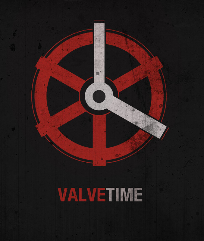
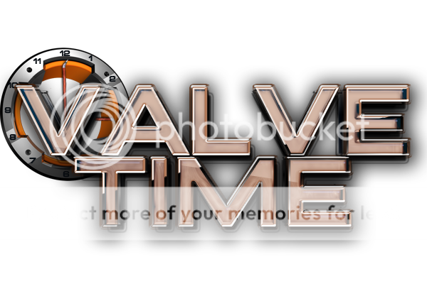
Since we launched ValveTime we've been using a temporary logo which we're itching to improve upon with a brand new logo. That's where you come in. We're opening a search to everyone to help design the new ValveTime logo!

There will be 3 awarded winners, with 1st place taking the crown as the official new ValveTime logo! 2nd and 3rd will be honourable mentions but still pick up a prize.
1st Place:
Valve goodies including: Signed Left 4 Dead 2 poster, Dota 2 t-shirt, Portal 2 Collectors Edition Guide, Aperture Science Mug, Aperture Science water bottle, a Portal keychain and stickers for all Valve titles. + CS:GO beta key
2nd & 3rd Place:
Honourable mentions and a CS:GO beta key each.
Be creative, we don't want to put artistic restraints on your ideas. Keep in mind however, we're a fansite centred around Valve Software (not just Half-life 2 anymore!) and we'd love to see that come across in the design.

To enter you can post your entry in the comments below, email us ([email protected]) or use our contact form. Please take the time to read our terms and conditions, this competition closes 4th May 2012 11:59pm after which no entries will be accepted. Good luck!
 

Attachments

  • slide.jpg
    slide.jpg
    160.9 KB · Views: 47,330
A water bottle? this is gonna get ugly.


In all seriousness though, the watch sucks, its about time we got something else.
 
I dunno Yorick, I think it has ironic charm!
 
Here is my entry, don't know if I'm allowed to use this many logotypes and fonts
http://i.imgur.com/T7njR.png
The site switched from HL2.net to Valvetime in order to broaden our scope from one game to all of Valve's titles. This logo just repeats the same mistake of limiting ourselves from the getgo to only what Valve currently has released.

Not to mention it's the lord of all tacky and couldn't be scaled down to a small size.
 
I think he's done a good job! Clever integration of the Valve and Steam hands, better than what you could do, you big meanie.
 
I think he's done a good job! Clever integration of the Valve and Steam hands, better than what you could do, you big meanie.
How did this site get this far when constructive criticism is so frowned upon...
Having the Steam logo in our own logo is just silly. Is it even legal? Why can't we form our own brand of style instead of a mish mosh of existing Valve type faces and stuff?

Yorick's idea is actually the best thing I've seen yet. An hourglass is a much better choice than a clock face, because it actually implies waiting, rather than a clock which is more of an informational thing, telling you the time. The theme of waiting directly ties to the name/theme of the site.

Not to mention, it does away with the boring and overdone circular shape, by having a distinctive shape of the broken hourglass instead. It's much more unique and interesting.

If I had free time I'd love to do a real version of Yorick's idea. I think to anyone who hasn't started yet, go for Yorick's idea or something similar.

Edit: Just noticed the end date, I should be able to find time eventually to make this.
 
Well Yorick's idea is actually something I came up with a while back when brainstorming some 'time' ideas, but we don't want people to be pigeon holed into the ideas we've had previously. We'd rather bring new creative minds to the table and open up the search beyond what we have to offer.

Also I'm not frowning upon constructive criticism, we seem to regularly have these miscommunications where something is posted which is apparently meant in good faith but comes across as just criticism to me. Perhaps I'm wrong, perhaps " it's the lord of all tacky" is actually useful feedback.
 
That was just some snark on the side of the main thing that I found wrong with the logo. If the guy has a problem with me saying that, he can take it up with me himself. I'm not flaming or harassing, so keep your pants on.

I'll expand on why I said it was tacky: Incorporating existing logos and typefaces just seems so amateur and predictable to me. Just like HL2.net's old banner with having a bunch of characters from valve games piled into it, only worse because it's like we're not even coming up with our own style, just a patchwork of old stuff that comes across as, well, tacky.

And of course I wouldn't want people to abandon any original ideas they have to do the hourglass. I just gave my opinion as one person, with reasons why I thought it was a strong logo.
 
What is wrong with the current logo? I like it. Is it because it is difficult to scale down/manipulate, etc.? I'd agree on those counts, but still... the current logo has a lot going for it.
 
Those are nice attempts! Keep 'em coming.

I just submitted my entry via email.
 
Any chance to getting the original more valve-like logo that was originally on the Facebook page to mess around with?
 
I've just done some cleaning.

This thread is for discussion about the competition and its current entries and for people to post new entries if they wish to.

ZT if you wish to leave any constructive feedback about things please do so via our Contact Form or make a post in the relevant forum. If your posts aren't going to be constructive and instead carry on bordering on trolling/insulting then we may have some problems.
 
Any chance to getting the original more valve-like logo that was originally on the Facebook page to mess around with?
I believe this is the one you're referring to.

If you want original in PSD/AI then you'll need to talk to DigiQ8.

There's a long and dark history to the concept of this logo. And a reason we're not using it that I do not wish to retell the story of. This was basically produced fully by DigiQ8 but deemed to be too similar to a logo created by someone else. Thus why we then used the logo from FishBulb.

vt_logo4.jpg
 
Not an entry, just some stuff I made in preparation for an entry that anyone can use if they like:
upRVA.png

f9AqF.png
 
I was working on one, but I dont think im going to finish it. I was going to make the "clock" part look better since its still just a stand-in, and then mess with the font, but then i remembered that im lazy so I stopped. Ill post it here in case it sparks an idea for someone or something. I can post the psd too.

lmjcl.jpg
 
34399140.png

My Submission that i sent in, just a simple one. But it's clean / the valve looks fancy!

Thinking of adding a few more features to the "Time" segment
 
Second submission,
gMAnz.png
Now that you've seen it, go to imgur and check the URL. Pretty sure that's worth something right there.

*Edit*
Updated it a bit, not an awesome URL anymore, but the text is easier to read!

http://imgur.com/avjF3
 
I do not give permission for people to use this to make their own entries:
Cx8oY.png
 
So, this morning i'd tried to pull off a design myself. Really fun!
My starting point was to (off course) get some concept of time in there, but keep it simple and bold and make a nod to the name ValveTime and get some tool thingy in there (you know steam, valve etc.).

So my concept of ValveTime is that you can try to measure it, but you always find yourself starting and stopping and try again. The timing is always of. Instead of a broken clock or something i ended up with a stopwatch. All about time, but even more about timing. This made it instant recognizable by the outline alone, so i could ditch the arms in a early stadium. The inner workings should be all about ValveTime, it incorporates a styled wrench and the letters V and T. Finally i'd tried to keep it as bold as the Valve, Lambda or Black Mesa sign in form and typography.

Let me know what you think, here is the first and second attempt:

ValveTime-009.png


ValveTime-010.png


Cheers!
 
Status
Not open for further replies.
Back
Top