Navigation
Install the app
How to install the app on iOS
Follow along with the video below to see how to install our site as a web app on your home screen.

Note: this_feature_currently_requires_accessing_site_using_safari
More options
You are using an out of date browser. It may not display this or other websites correctly.
You should upgrade or use an alternative browser.
You should upgrade or use an alternative browser.
Design A Logo For ValveTime - Win Valve Goodies + CS:GO Keys
- Thread starter Hectic Glenn
- Start date
- Status
- Not open for further replies.
- Joined
- Aug 8, 2004
- Messages
- 12,231
- Reaction score
- 241
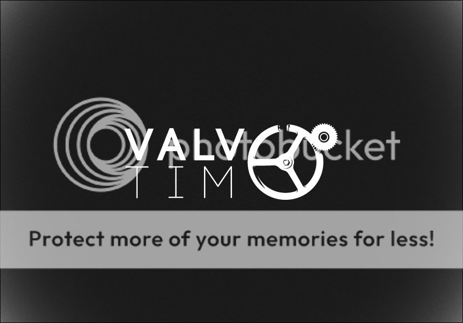
Clever, I like the idea but I struggle to see the 'E' in the valve at the end, I would suggest you perhaps have a shadow or someway of making an E more apparent.
(Assuming you were intending for the reader to see an 'E' at the end?)
(Assuming you were intending for the reader to see an 'E' at the end?)
Blue1510
Headcrab
- Joined
- Apr 25, 2012
- Messages
- 10
- Reaction score
- 2
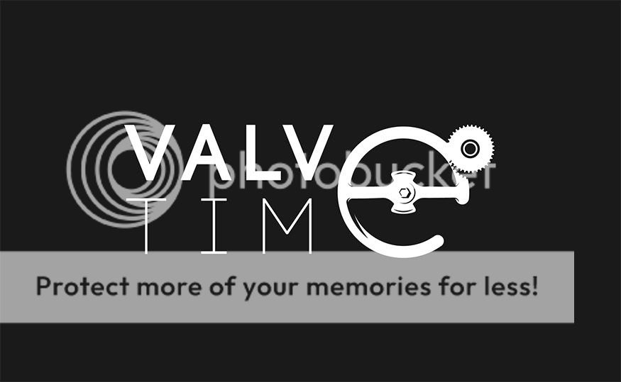
Well you guys gave some very good points to think about, here's the result:
^_^ .
Who's tim?
But on a serious note, the E would be far more visible if you also made a small break at the bottom of the valve identical to the top.
Remember one of the most important rules of graphic/logo design is to keep it simple, legible and easily recognizable at a glance. Where as your logo (as it stands) is easily recognizable for people who know what the site name already is and holds a simplistic and elegantly minimalist narrative. I could see people who didn't already know what the site name was, struggling to grasp an E.
Gah i hope that didn't sound condescending or anything, I'm guilty of doing the same thing too with some of my designs.
Áka
Headcrab
- Joined
- Apr 27, 2012
- Messages
- 6
- Reaction score
- 3
This one is as simplistic as it gets. Not sure whether this is what the site needs though. Nevertheless it was really fun experimenting with a minimalist approach.
The colored one even has a kind of meaning to it. How the Valve is keeping something back. It is not hard to figure out, I guess.")

The colored one even has a kind of meaning to it. How the Valve is keeping something back. It is not hard to figure out, I guess.
Yoyo1244
Hunter
- Joined
- Apr 25, 2012
- Messages
- 46
- Reaction score
- 8
Clever, I like the idea but I struggle to see the 'E' in the valve at the end, I would suggest you perhaps have a shadow or someway of making an E more apparent.
(Assuming you were intending for the reader to see an 'E' at the end?)
Who's tim?
But on a serious note, the E would be far more visible if you also made a small break at the bottom of the valve identical to the top.
Remember one of the most important rules of graphic/logo design is to keep it simple, legible and easily recognizable at a glance. Where as your logo (as it stands) is easily recognizable for people who know what the site name already is and holds a simplistic and elegantly minimalist narrative. I could see people who didn't already know what the site name was, struggling to grasp an E.
Gah i hope that didn't sound condescending or anything, I'm guilty of doing the same thing too with some of my designs.
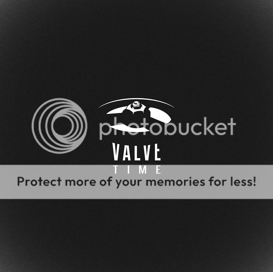
Thank you for your insight
.I decided to post it even though I wasn't feeling completely happy with it
so I continued on and this is the result:
Much happier with how this one came to be I learned a lot
.Tinckerbel
Medic
- Joined
- Apr 21, 2012
- Messages
- 18
- Reaction score
- 7
Thank you for your insight
I decided to post it even though I wasn't feeling completely happy with it
so I continued on and this is the result:
Much happier with how this one came to be I learned a lot
I like it!! Don't quite get the gear even though i know it came from the HL2 logo.
But nevertheless really nice work!
Cheers!
Áka
Headcrab
- Joined
- Apr 27, 2012
- Messages
- 6
- Reaction score
- 3

I'm trying so hard not to see it because this is a beautiful logo but the middle part reminds me of the EA logo. I can't help it. On the other hand, combining the L and the hands of a clock is a clever idea.
Áka
Headcrab
- Joined
- Apr 27, 2012
- Messages
- 6
- Reaction score
- 3
I put us there craving for the new stuff, unable to reach the valve. It also represents the main purpose of the site: giving fans the necessary amount of news and info that keep us interested in the games of the company. Plus, if I'm lucky, by looking at the hands, you'll feel that this is a community.

Blue1510
Headcrab
- Joined
- Apr 25, 2012
- Messages
- 10
- Reaction score
- 2

Work-In-Progress, looking for feedback.
There's also tons of meaning, hidden and obvious here, so tell me if you can find it ^.^
Wondering if the fluid elements of the logo should be present, elaborated on, or removed entirely. IE i figured the leaky valve/steam were pretty obvious entries and exits to the piece, but it could work without it i think.
Also it condenses really nicely,

Could you guys see the water-works piece as a header to the site? or is it just too complicated?
Y
Yorick
Guest
Those are both good ideas, Riomhaire. I haven't seen them used so far, either.
Something to consider is that we're not just talking about a logo for the site - it'll be our brand, and will be used on Facebook, YouTube, etc. Having something that can be sized somewhat small while still being recognisable would be the ideal.
Could you guys see the water-works piece as a header to the site? or is it just too complicated?
Something to consider is that we're not just talking about a logo for the site - it'll be our brand, and will be used on Facebook, YouTube, etc. Having something that can be sized somewhat small while still being recognisable would be the ideal.
Yoyo1244
Hunter
- Joined
- Apr 25, 2012
- Messages
- 46
- Reaction score
- 8
I am not looking forward to this competition ending. Then we'll have to actually pick one
What a horribly difficult decision this is.
Me neither, they're so fun to make!
I have another one up my sleeve is there a limit to how many times one can submit?
Y
Yorick
Guest
I have another one up my sleeve is there a limit to how many times one can submit?
Nope! Go nuts!

Yoyo1244
Hunter
- Joined
- Apr 25, 2012
- Messages
- 46
- Reaction score
- 8
Had to look at it for a while before I could even see the V and the T.
From my experience there are 'two kind' of people the kind who "sees" these sort of logos right away and the kind who don't.
As well it's the kind of logo that makes you look twice be cause you want to get what's there, imho that is.
Blue1510
Headcrab
- Joined
- Apr 25, 2012
- Messages
- 10
- Reaction score
- 2
How do you fancy this one?
Ahh ahh you cut the E's head off! you monster! quick someone get the glue!
(But actually i love that one, if you put the E's head back on i would root for it!)
Righto, More submissions from me (more like my last submission just polished up)

This one's just silly, it elaborates on what people were talking about before (on actual meaning to the valve and steam). It's a fully functional water-clock. Where the valve controls the drip-rate or the passage of time minute-by-minute, and steam eventually pushes the major changes in clock time.
As i said before, i really loved the concept of a Valve/Steam being the entry and exit to the artistic piece, even if it's very difficult to work them in visually without making the piece huge and distracting the eyes from elsewhere. I tried a few versions with the outside elements being various opacities, and that seemed to settle the distractions quite a bit.
A version without the fun-stuff

This one still has tons of meaning in it. I decided to make each of the E's in the title the literal "3s" on the two minute gears of the clock. Additionally the hours present in roman-numerals, leaving the "V" for 5 as the opening to the piece.

Lastly the simple, title, no huge flashy logo, no giant clocks and water towers. But to me i fell absolutely in love with this one after all the work i put into designing and making the previous two culminate in this final image.
This along with a few other versions shall be my actual-final submission to the contest. Hopefully someone likes something i came up with ^.^
- Joined
- Aug 8, 2004
- Messages
- 12,231
- Reaction score
- 241
Just as a reminder, 8 hours left until no further submissions will be accepted.
- Status
- Not open for further replies.
Similar threads
- Replies
- 0
- Views
- 13K
- Replies
- 0
- Views
- 3K